Co-design Session #3 Synthesis Report
The third co-design session focused on the topic of Threshold moments. At this session participants were tasked with discussing their experiences with different types of thresholds or transition points in their urban experience, brainstorming solutions to the challenges they experienced, and prototyping their ideas. For the discussions, groups were assigned one of three topics related to thresholds: Up and down (moving between different levels of a space), In and out (moving in and out of spaces), and Getting around (transitioning between different modes of transportation). For more information about this session please visit the Co-Design Session #3: Thresholds post.
Overarching Themes
Up and Down
Groups discussed thresholds they have encountered moving between levels. The participants reported thresholds such as: curb cuts, doors of different types (e.g. automatic, revolving, sliding and multiple sets) in various contexts (e.g. subway, elevators), escalators, gurney, hill, kneeling buses, ladder, railings, ramps, scaffolding, sidewalks and pavements, slide, stair lift/stair climber, and staircase/steps.
In and Out
Groups discussed thresholds they have encountered when entering or exiting buildings in private or public spaces. The participants reported thresholds such as: navigating through construction sites, access controls and buttons in buildings (e.g. entrances, parking exits etc.), doors, temporary and permanent ramps, handrails/guardrails, steps, and subway platforms with various obstacles to navigate around.
Getting Around
Participants discussed their experiences moving around in the city and the thresholds they experience. The groups reported thresholds such as: construction sites, bike lanes, buses/taxis, uber, ferries, access controls and buttons, crosswalks, curb cuts, doors (automatic, elevators, subways, multiple sets, revolving and sliding), parking lanes, different noise areas, steps and stairs, and entrances to subways and streetcars and trains.
Negative and Positive Experiences with Thresholds
Groups highlighted some of their positive and negative experiences with thresholds.
Participants discussed thresholds they experience when using public transport (e.g. carrying bike around between different modes of transportation). Groups discussed the set back of bike lanes which often block off transit drop offs (e.g. bus, streetcars and wheel trans) and create anxiety in pedestrians who accidently wander into bike lanes to cross the street. Other groups commented on the benefit of bike lanes which create a divide between cars, bicycles and pedestrians and reduce the risk of accidents. Bike rentals were also praised by some groups for providing the comfort of bikes that do not have to be carried between different modes of transportation and can be left behind.
Group discussions also included buses and bus stops. Participants reported that the interior design of buses often create a choke point because they do not have adequate space for mobility devices. Further, bus stops that were often relocated due to prolonged construction, and street furniture that blocked bus exits posed a barrier for many users. However, many participants appreciated the auditory announcement systems, rack for bikes and the kneeling ramp options in buses. Similarly, groups also discussed experiencing difficulty getting on and off subways due to the overcrowded environment, and feel rushed because the doors close too fast to easily transition onto the platform or onto the train. There was also discussion about the presence of obstacles that are encountered on a subway platform and the step between the subway and platform that acts as a barrier for many people. Participants also talked about how disoriented they feel when they get off transit and they are not sure where they are.
The groups also discussed their experience with thresholds on the streets. Some of the challenges discussed included clutter and street furniture that becomes obstacles for pedestrians especially people with mobility devices (e.g. benches, bike stands too close to road, bike parked in the way, garbage bins, planters, pole, tied up dogs etc). Other obstacles included cracked pavements, lack of curb cuts, poorly designed ramps and slopes, which create issues for mobility devices (e.g. wheelchairs and baby carriages). Roundabouts were expressed as being inaccessible and anxiety provoking for many users, particularly those with low vision. Participants also shared some positive experiences, which included all-way crossings with audio indicators and associated time countdown for ease of crossing.
Participants shared their positive and negative experiences in indoor spaces. Some groups commented on the safety hazards associated with the design of staircases (e.g. lack of proper handrails, lack of clear transition into the stairwell from the ground, and tonal contrast to identify depth of the stairs, and lack of adequate indicators for stairs, and floor number). Other issues reported included automatic doors opening and closing too fast, entrances too narrow for wheelchairs, double doors opening in different directions and narrow space between two sets of doors and tight corners with insufficient space for turning. Glass walls that are becoming very common in buildings also reported to be confusing for service dogs as they look similar to doorways. Some of the positive experiences included wide doors with appropriately placed buttons, doors with motion detection features and sliding doors. Groups also discussed the issue of access in indoor spaces which require access cards or button controls which are not accessible for all users. These issues were also discussed in the contexts of elevators which often do not include accessible controls (e.g. no braille for blind users, inappropriate placement of controls, no clear indication of elevator arriving etc). Participants expressed that the access issue extends to attitudinal barriers and sometimes they are not allowed entry due to carrying service animals. Some of the positive comments included elevators that announce each floor, provide braille controls, include signage displaying floor numbers, include buttons to call special elevator for wheelchair access and sensors adjusting doors for people.
Imagining Better Experiences for Thresholds in the Future
Participants were asked to imagine better experiences for thresholds in the future.
Up and Down
The groups focusing on the Up and Down topic identified the following features and improvements that could make better thresholds: sturdy and graspable handrails, multimodal information announcements, good wayfinding (tactile, clear and easy to find accessible route), tactile warning surfaces (including audible features), indication of direction of escalators, building wide, good tonal contrast and good lighting at night, gentler ramps, good crowd flow/control, snow removal/melting, and standardization in approaches for change in level.
In and Out
The groups focusing on the In and Out topic identified the following features and improvements that could make better thresholds: automatic doors, personalization of experience in a building (preferred level of assistance, application of technology for movement and assistance according to each person’s parameters), systems and procedures for all tenants during an emergency (including people with disabilities), keeping entrance-ways and approaches to buildings clear of snow and ice (e.g. with coverings, heated areas, robot shovelers, better drainage), better elevators (signals when doors open / reach a floor, longer timing for doors, personalized experience such as language used, multiple modes of signalling such as light, sound, and voice), and driverless vehicles to bring a person from the roadside to the building entrance (over terrain and obstacles and through weather conditions).
Getting Around
The groups focusing on the Getting Around topic identified the following features and improvements that could make better thresholds: finer details in navigation apps, Be My Eyes for transit, automatic TTC payment with mobile device (such as Apple Pay), ubiquitous data connections, unlimited data for people with disabilities, audio announcements when exiting transit (for wayfinding for example), standardization (e.g. consistency in bus stops, ramps, curb cuts, sidewalk material, audio announcement frequency, placement of controls), wider sidewalks that can accommodate 2 wheelchairs, more pedestrian focused streets, street furniture that encourages use but does not obstruct, dedicated pick up / drop off areas for taxis, easier thresholds for cars/taxis, accessible/audio meters in taxis, integration with transit apps to inform service provides of blindness, construction sites with solid boundaries (for canes) and with audio warnings, and updates to wayfinding apps for construction.
Prototypes
Access App & Elevator
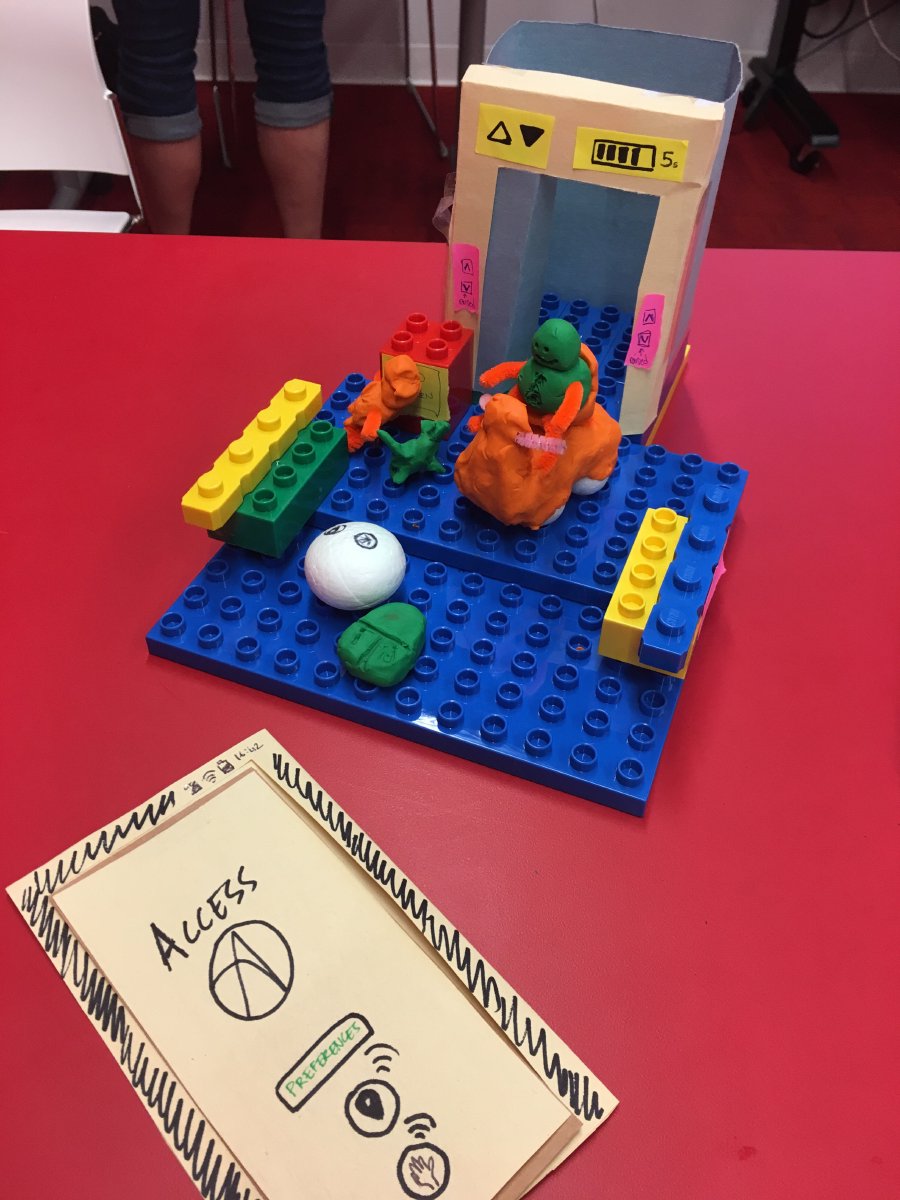
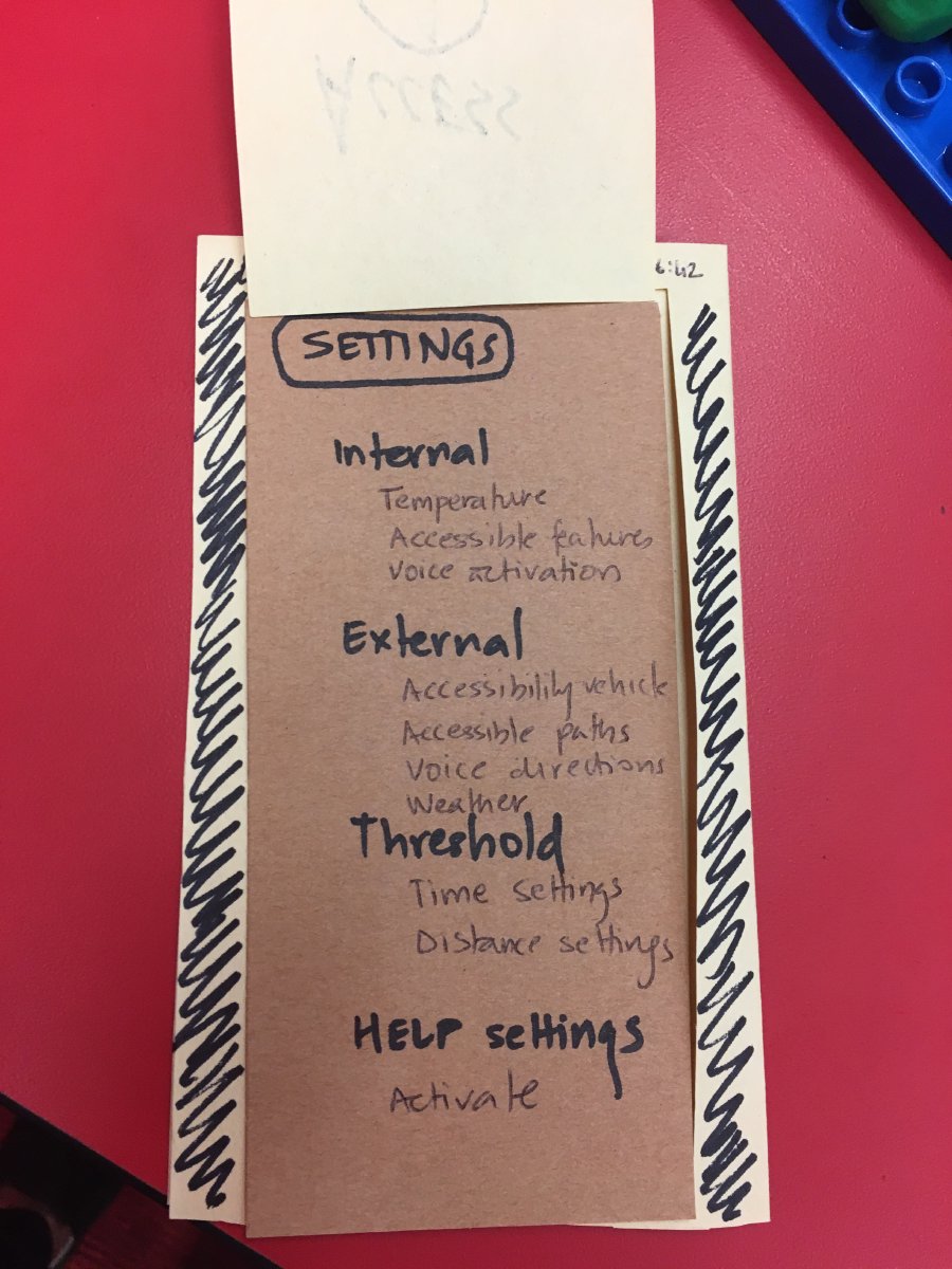
Description: This group suggested an improved and more accessible elevator design that is integrated with an “Access” application. Users can set up preferences for accessibility and indicate their prefered settings (e.g. temperature, voice activation). The app also provides information about the the external environment (weather info) and internal space (e.g. timing of the automatic doors). The elevator is accessible and provides enough space inside for mobility devices to turn around. The control panel inside elevators is placed on the left or right side and at a lower height, thus, no turning around is needed to press the buttons. The elevator’s control panel is voice activated and provides information about where the passenger is going. Numbers are also raised and have braille indicators. Where there are multiple elevators, there would be a display outside elevators to tell which one is coming and how long it will take. The arriving elevator beeps a few seconds and provides visual indications before it arrives to notify the users. There will also be a call for help button to provide assistance when needed. This group also proposed a service vehicle that is integrated with the app and can pick up the person from outside of the building and take them to the lobby.
One of the main criticism that this group received was regarding the functionality of some the services including the Help button and some of the app features for the deaf community. There was also a comment about inaccessibility of the app for people who are not accustomed to technology and don’t use smartphones. In response to this feedback, the group suggested including a key/fob that can be programmed based on user’s preferences.
Seescape Toronto
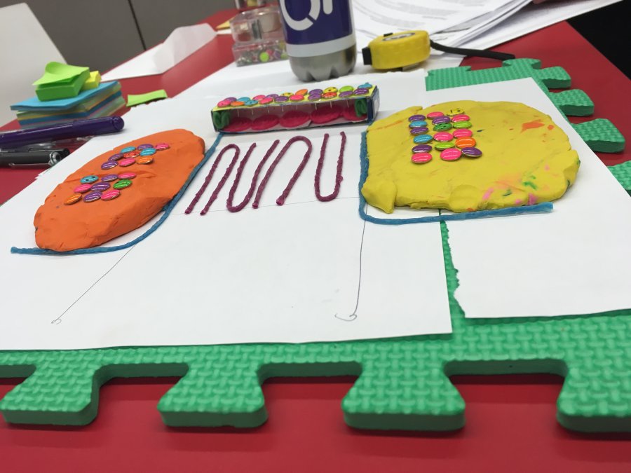
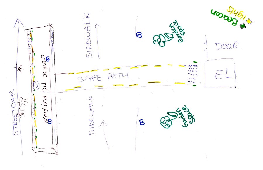
Description: This group focused on building a safe passage between the streetcar stop and a building’s elevator. They proposed an elevated platform with a long slope for the streetcar stops. The platform would be illuminated and wide enough so wheelchairs can easily maneuver. From the platform, there would be a safe path to the sidewalk that includes benches, green space, a braille strip, and it is equipped with beacon technology to announce the distance to the destination (particularly to the elevator). Once at the elevator, the doors and buttons are clearly visible, tactile and provide audio feedback. There is also a button for emergency contact, and guidelines for someone panicking inside the elevator. This solution is also integrated with an app, which would notify the users of any problems or barriers along the way from the platform to the elevator.
One of the main criticism this group received related to scalability of this solution and how it could be integrated at each stop and with every building. As a response to this feedback, this group suggested a network of paths branching off from transit stops and at major sites.
In-Struct App
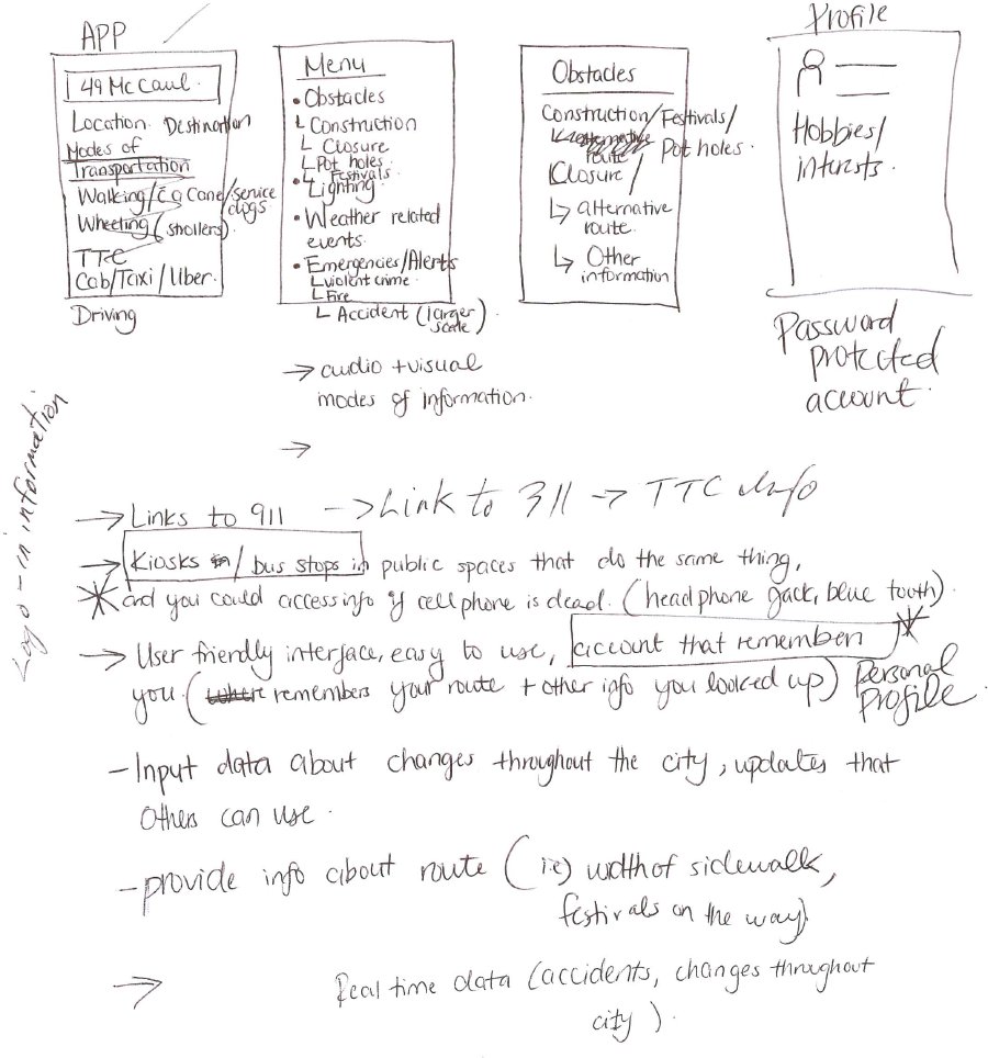
Description: This team proposed building a mobile application to help people switch between different modes of transportation. Users can enter their preferences and things they want to avoid in the app, such as steps. Once users enter the destination/ address, the app can recommend the most accessible route and transit option based on their preferences. The app is also connected with social media and other real-time news feed, thus the recommended path would include real-time data (e.g. accidents, crimes, weather, etc.) about the route. Users can also input information in the app to make it available for others. Each user has a password protected profile, so they can access their account from different phones, computers or stations if their phone runs out of battery. The app also provides a direct link to 311 service.
One important feedback this group received was regarding the inaccessibility of such a solution for people who don’t use smartphones, are not accustomed to using technology, or do not have access to a Wi-Fi connection.
Indoor Accessible Mapper
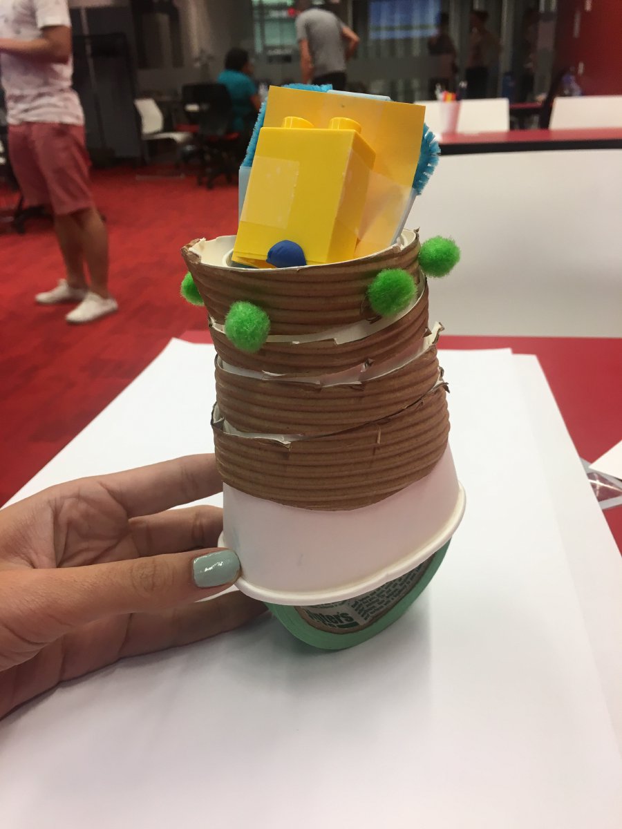
Description: This group tried to address the problem of wayfinding when entering a building. They proposed having a little robot with a screen and lights to accompany and guide an individual on their route. They would provide information about accessibility features inside buildings and accessible indoor pathways. These robots are equipped with voice/ASL/ text description of the route and programmed to stay within 3 feet of a person. People can input their needs (wheelchair, ASL, visual, etc.) via their home computer, or their mobile phones and request for a robot to wait for them upon their arrival. There is also a recall button to request a robot to come back when they’re ready to leave a building. This group proposed a system similar to a vending machine that can dispense these mini robots upon request. These robots can be folded at the end of each working shift. The robots also have an emergency mode and able to lead people to the nearest exit during emergencies. One of the main feedback this group received was related to the size of these robots and whether they can disturb animals, and create tripping hazards for people who can’t see them. The group responded that the proposed robots would be about 3 ft tall and that they would provide audio indications to inform others of their presence in the space.
Level Drop Warning Plate
Description: This group proposed installing a rough plate over the current streets to inform pedestrians of changes in the ground level through multimodal cues. This plate would include grooves on its surface as well as illumination and color cues to provide both haptic and visual notifications regarding the ground level changes. They proposed installing the plate over a hollow space, thus, cane users would recognize different audio feedback from the hollow space. There would also be a rumbling sound and a heating system embedded into the plate to provide audio feedback and keep the plate above the freezing point during the colder seasons. One of the main feedback this group received related to inaccessibility of the suggested multimodal cues for people who experience anxiety, particular mental health conditions, epilepsy, and migraines. It was also mentioned that the grooves on the surface may make it difficult for mobility devices to drive over the plate.
Themes that emerged from the Prototypes
The prototyping activity enabled us to draw out specific qualities that the participants thought were important and should be included in the design of inclusive cities.
The prototypes suggested that groups considered a combination of low tech/ analogue techniques with more high tech solutions to be able to address a wider range of needs. Most teams included a mobile app to notify users of real-time changes, alternative routes, and also provide information in different languages and modalities. Most prototypes tried to include an option for entering personal preferences to receive directions based on individual needs. Some of the prototypes also aimed to enable users to control and adjust their surrounding environment based on their preferences, such as timing of the automatic doors, voice activation of the controls, temperature of the indoor spaces, etc. All groups tried to incorporate multiple modes of interaction (haptic, visual, audio) to address a broader range of needs. Some of the groups emphasized the importance of integrating real-time data, such as construction, snow removal, accidents, fallen trees, crime, weather info, broken elevators, etc. to inform users of the most current accessible routes.
The IDRC team went through all the notes and the artifacts from this session and extracted as many ideas as possible for the hackathon session. The IDRC team and Sidewalk team went through these ideas once again and picked about 3-4 ideas to be built during the hackathon.
Raw Data
- Scanned images of the group worksheets and peer feedback from the entire session (PDF)
- Tables generated based on the collected information in co-design session#3 (Word document)

